12 Brands That Use Handwritten Type Beautifully
Handwritten fonts have a unique power in branding. While many modern typefaces aim for precision and perfection, handwriting embraces small imperfections. Those irregularities make designs feel more human, more personal and often more memorable.
That’s why handwritten typography appears so often in branding. It suggests authenticity, creativity and personality in a way that clean and structured fonts rarely do.
From global companies to emerging lifestyle brands, many businesses use handwritten typography to create warmth, character and a more human connection with their audience. Here are twelve brands that use handwritten fonts beautifully, and why their approach works.
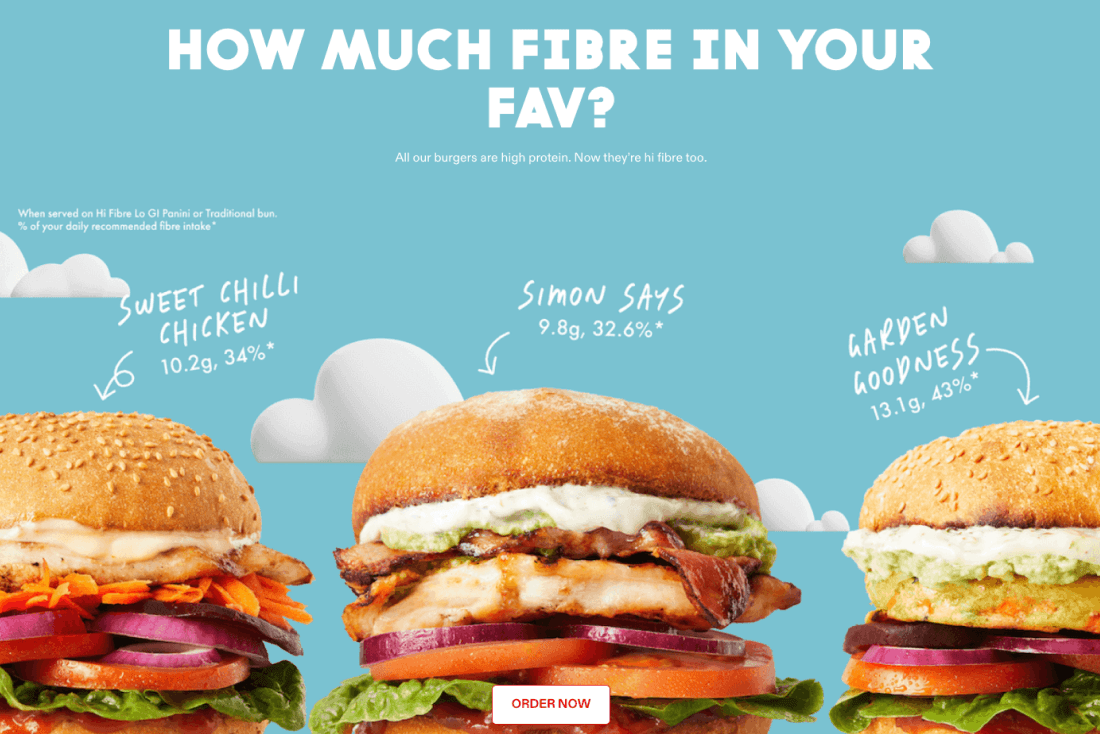
Grill'd
The Australian burger chain uses the handwritten typeface Juniper Bay across its branding, menus and packaging. The loose, informal lettering gives the brand a relaxed, approachable feel that aligns with its fresh, laid-back positioning.
Why it works: The typography feels casual and friendly, supporting the brand’s relaxed tone and supports the handcrafted food message.
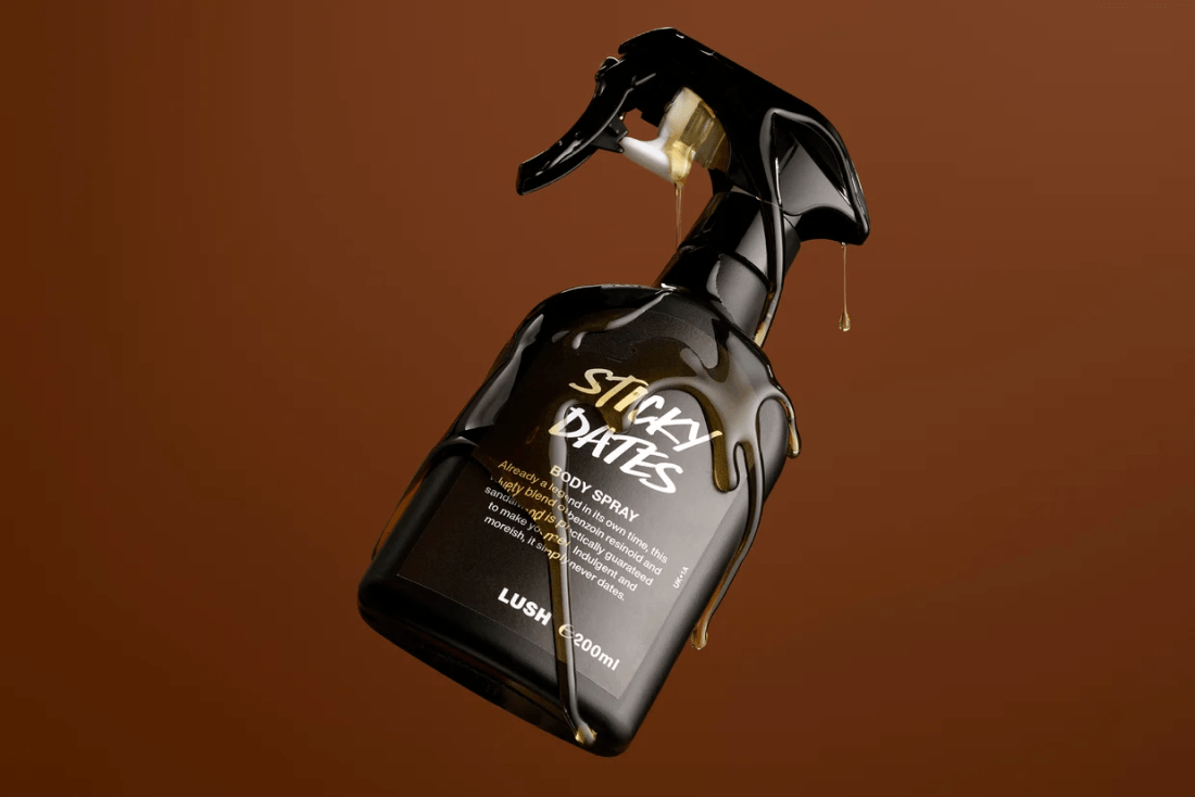
Lush Cosmetics
Lush’s chalkboard-style handwritten typography appears on product labels and in-store signage. The rough, handwritten aesthetic reinforces the brand’s focus on handmade cosmetics and ethical production.
Why it works: The typography communicates craftsmanship, aligns with the handmade brand story, and is instantly recognisable in-store.
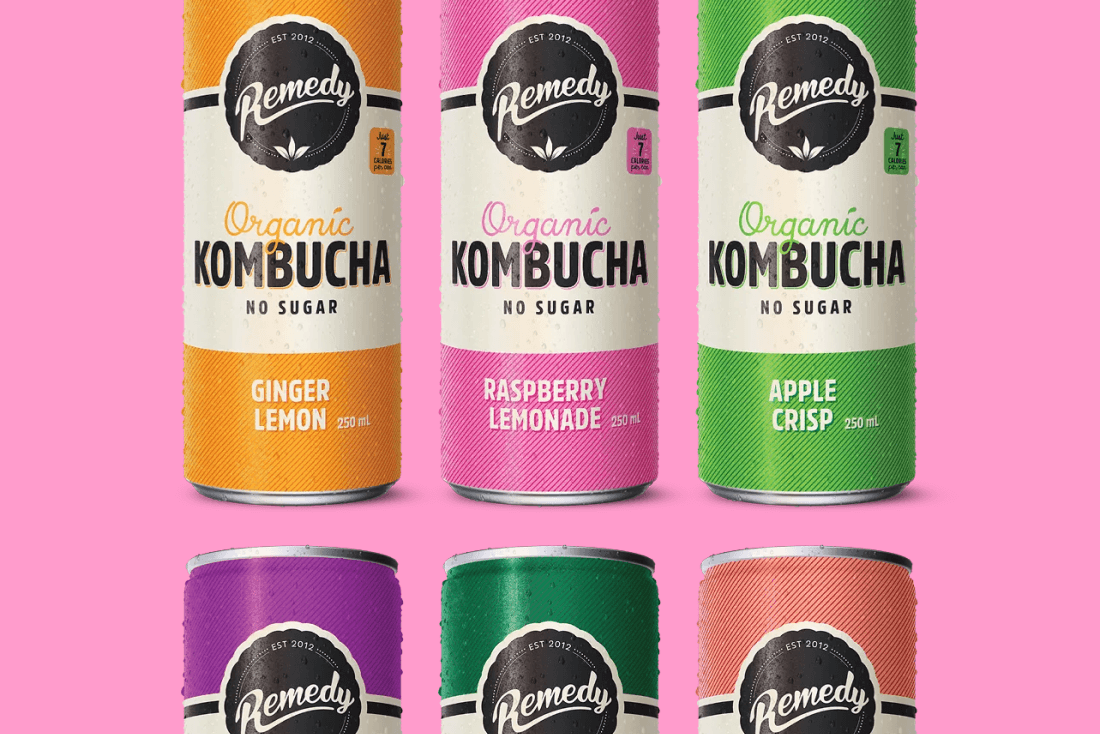
Remedy Drinks
Remedy Drinks uses handwritten typography across its logo, packaging and marketing to create a lively, handcrafted feel. The energetic, imperfect lettering reflects the brand’s home-brewed origins and adds personality on shelf.
Why it works: The handwritten style feels energetic and handmade, reinforcing the brand’s small-batch story, creating strong shelf presence.
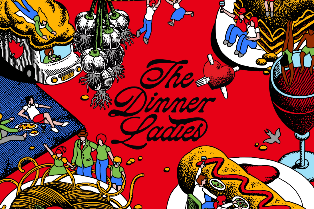
The Dinner Ladies
The Dinner Ladies uses a script-style wordmark paired with slightly rebellious hand-illustrated elements to create a warm, personal feel. The inky, fluid lettering gives the brand a handmade quality that reinforces its home-cooked positioning.
Why it works: The script lettering feels personal and authentic. The fluid strokes add warmth and character. The overall style reinforces a sense of care and comfort, with a slight edge.
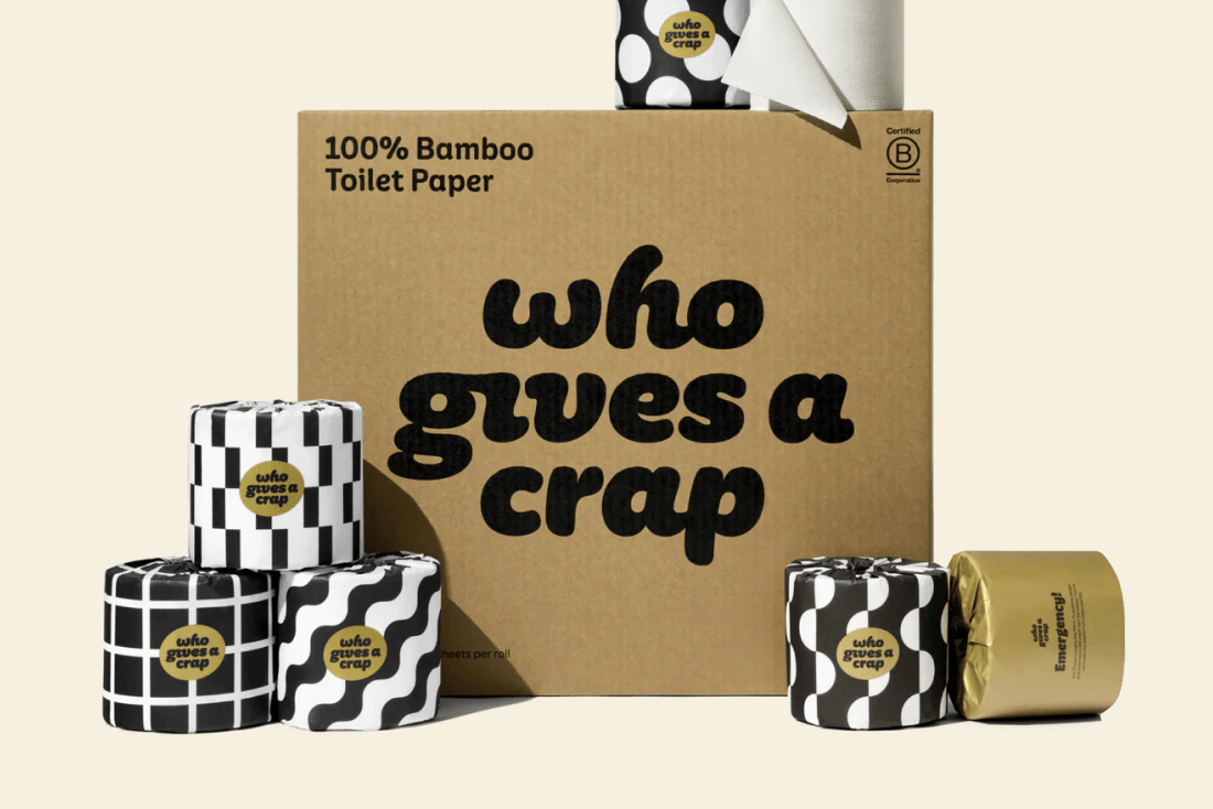
Who Gives a Crap
This Australian toilet paper company uses playful handwritten typography in its branding and marketing. The lettering fits perfectly with the brand’s humorous voice and irreverent personality.
Why it works: The typography is playful and memorable. It supports the brand’s humour and creates a visually distinctive identity.
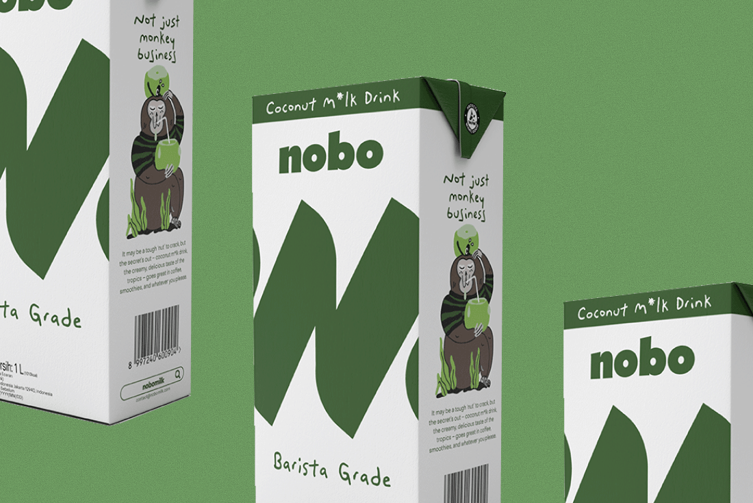
Nobo Milk
Nobo uses loose, hand-drawn lettering paired with simple illustration to create a playful, expressive identity. The casual strokes and imperfect forms give the brand a strong personality, helping it stand out in a category dominated by clean, minimal typography.
Why it works: The handwritten style adds personality, feels modern and youthful, and reinforces an approachable, human tone.
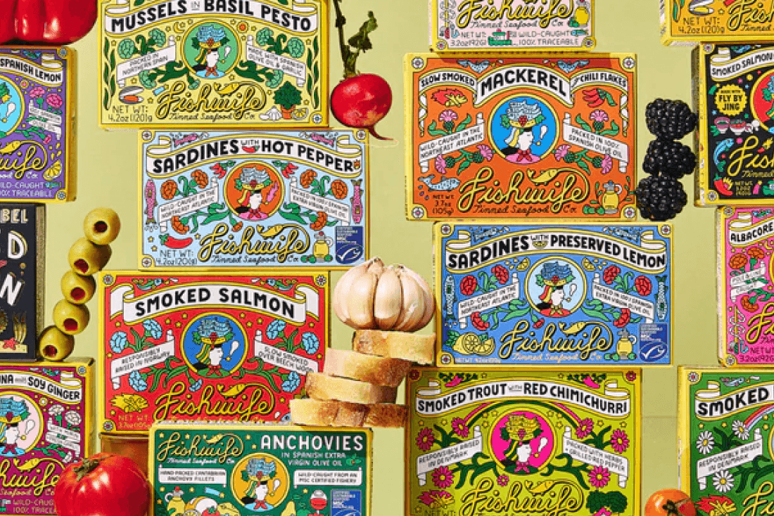
Fishwife
Fishwife, the modern tinned seafood brand, uses expressive typography and playful hand-drawn elements on its beautifully illustrated packaging. The combination of bold colours, illustration and loose lettering gives the brand a distinctive personality in a traditionally boring category.
Why it works: The brand has a very strong personality with a modern and playful tone, ensuring it stands out in a traditionally dull category.
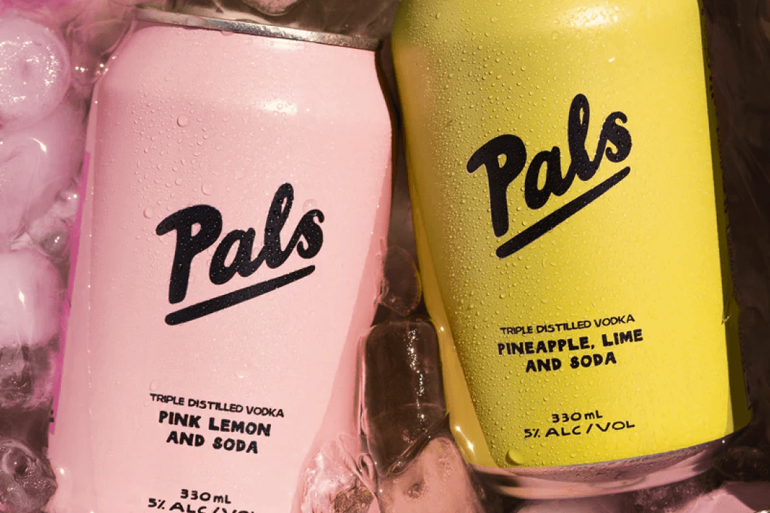
Drink Pals
Drink Pals uses loose, handwritten-style lettering to create a friendly, playful identity. The casual strokes feel approachable and informal, helping the brand stand out against the clean, minimal typography common in the drinks category.
Why it works: The playful lettering reinforces the social “pals” concept, feels approachable and human and adds a distinctive personality on shelf.
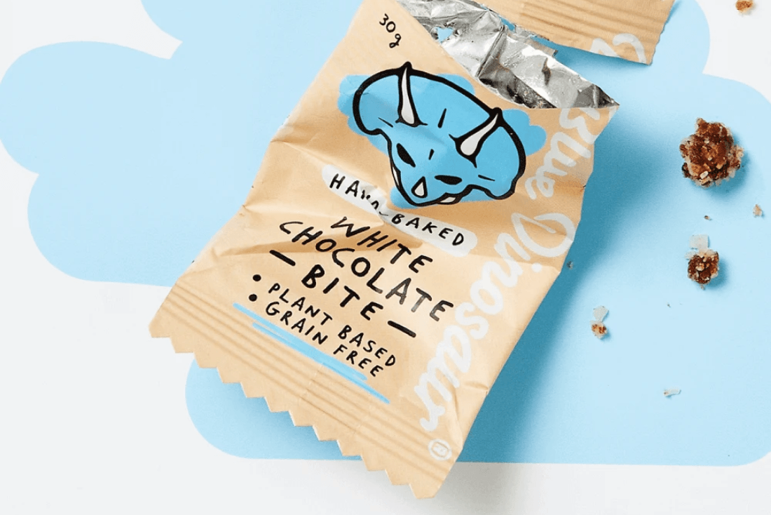
Blue Dinosaur
Blue Dinosaur uses loose, handwritten-style lettering paired with bold illustration to create a relaxed, natural identity. The spontaneous, imperfect strokes give the brand a human feel that aligns with its focus on simple, real ingredients.
Why it works: The handwritten lettering feels casual and authentic, reinforces a natural, uncomplicated positioning and adds strong shelf presence.
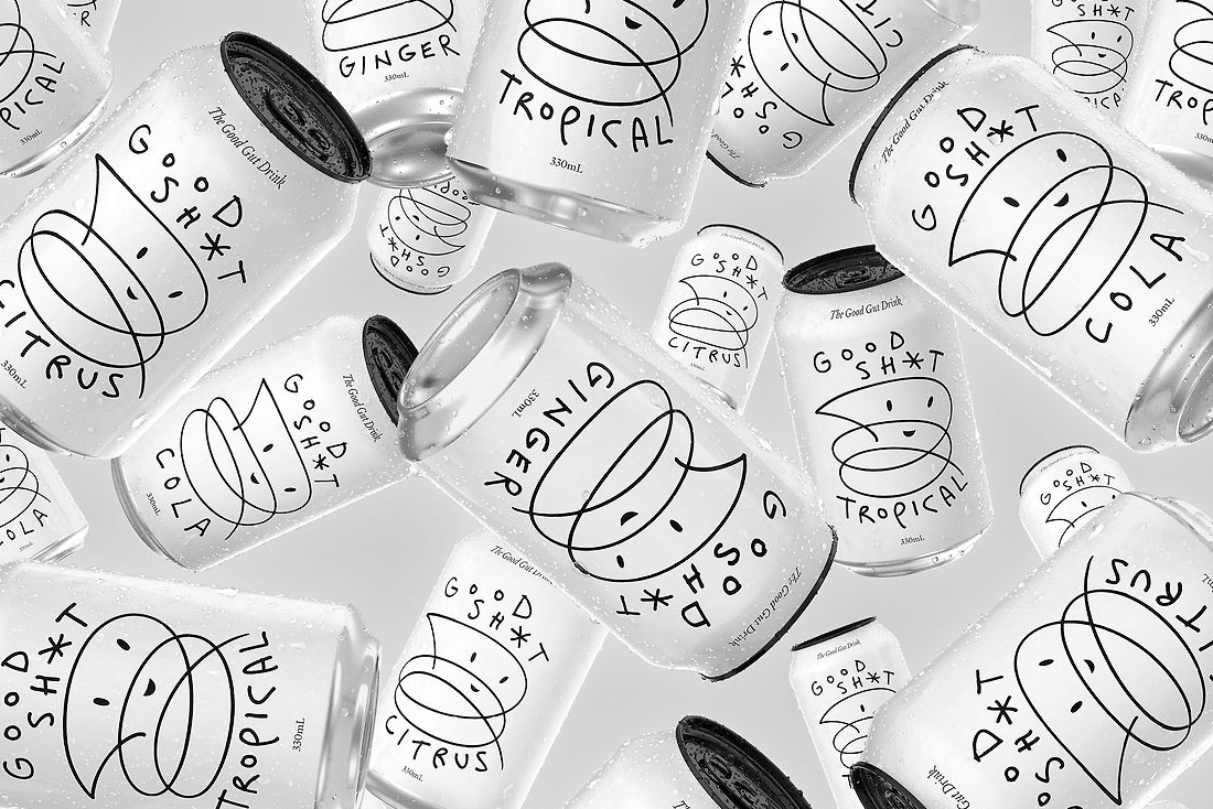
Good Shit Soda
Good Shit Soda uses bold hand-drawn typography and playful lettering across its cans and branding. The expressive, imperfect lettering feels energetic and human, perfectly matching the brand’s quirky, irreverent tone. It’s exactly the kind of handwriting-style typography that adds personality and stands out on shelves.
Why it works: The loose, hand-drawn lettering amplifies the brand’s attitude, creates energetic and memorable packaging and feels like a natural extension of the brand voice.
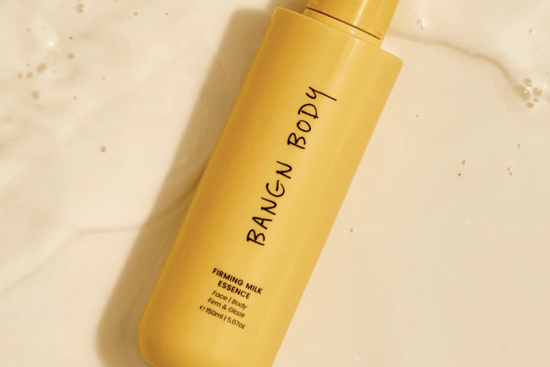
Bangn Body
Bangn Body uses a handwritten-style logo across its packaging and marketing to create a friendly, approachable identity. The loose, imperfect handwriting adds a human touch to the brand, offering a contrast to the clean, clinical typography common in the beauty space.
Why it works: The handwritten logo feels personal and inviting, reinforces a fun and approachable tone, adding warmth and character to the brand.
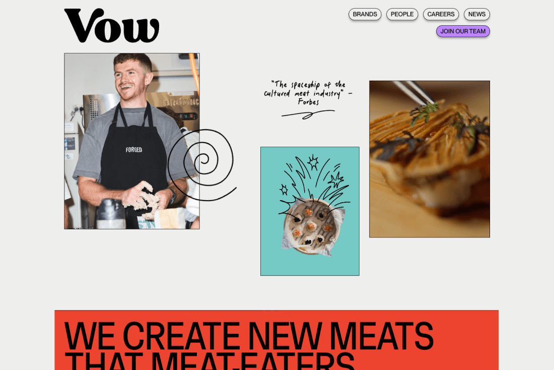
Vow
Vow uses Juniper Bay across its website and social media as hand-drawn subtext, adding a casual, flowing script to an otherwise high-tech brand. The loose lettering softens the clinical nature of lab-grown products and introduces warmth and personality.
Why it works: The handwritten typography humanises a technical product, adds a friendly and approachable tone online and creates a distinctive visual voice.
Keep reading
View all articles →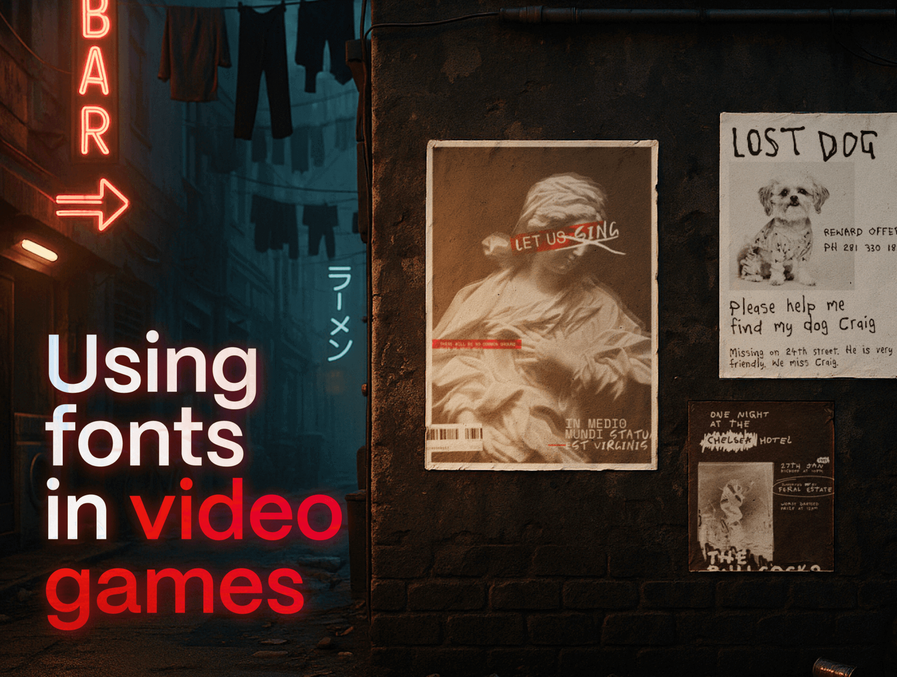
Font Licensing for Video Games: What Developers Need to Know
Unsure which font license you need for a video game? Learn the difference between Desktop and App Licenses and how fonts can be used in games.
Read on →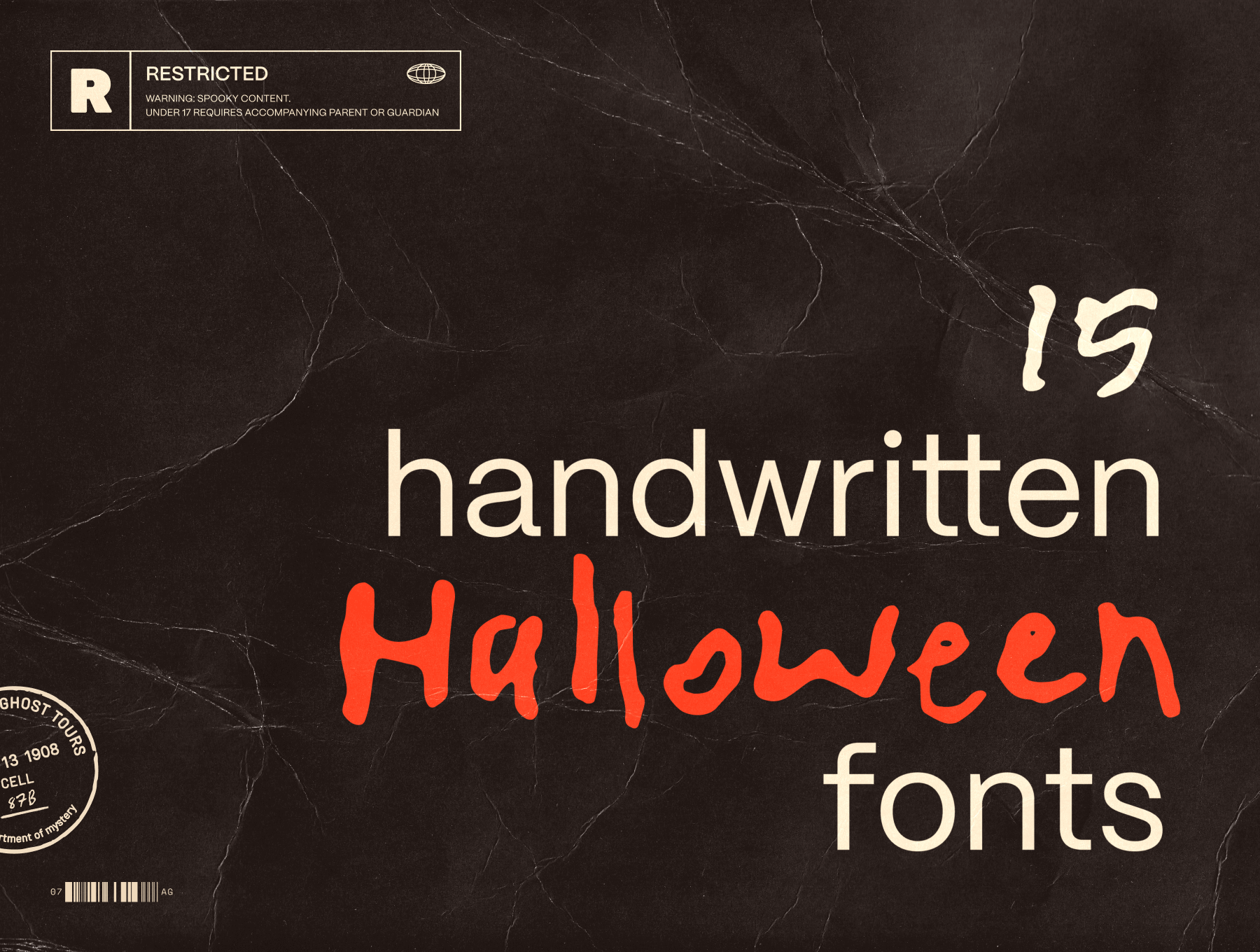
15 messy handwritten Halloween fonts
From jittery brush strokes to scratchy marker lines, we’ve curated 15 of our favourite spooky, messy and hand-crafted fonts to inspire your Halloween designs.
Read on →

