Behind the Scenes: Creating the 'Infamous' typeface
I had a pretty clear objective for Infamous: I wanted a typeface that is rough, textured and looks great in uppercase. This vision meant I found myself zooming through the process as I was super motivated to see where I could take it. Here's how it went.
Typeface name
InfamousWorking Title
BrighterCreated With
iPadTool
Brush: 'Impressionist'
Initial sketches
Infamous began as most fonts I make do: with the lyrics to whatever song I am listening to scrawled out. As it's a handwriting font, this method helps me create natural, flowing type (rather than one that needs to be created letter-by-letter).
My vision for this font was: scratchy, textured, tight kerning, looks great in uppercase.
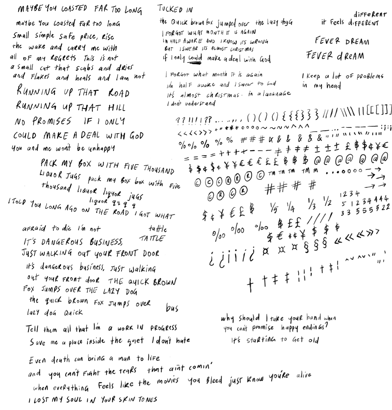
I wanted something that you could use on a poster, by itself, with little to no treatment (and it would still look awesome). I needed to find a balance between unruliness and consistency: I made the letters wild, but kept the angle the same. This was conceived on my iPad, in Adobe Fresco, with a brush called 'Impressionist'.
Picking the 'best letters'
The sketching process involves a few rounds of sketching, importing, vectoring and repeating. For Infamous (tentatively called 'Brighter' at the time), I started with all the base Latin characters, imported, noted my favourites, then began sketching again for the extended characters (such as multi-linguals and more unusual Latin symbols).
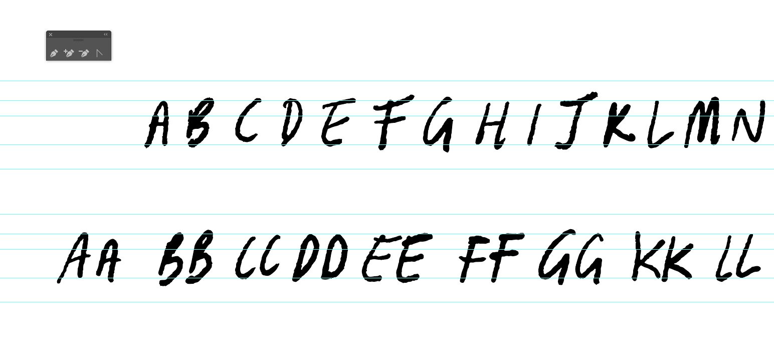
Once I had a decent character set sketched out (A-Z, uppercase, lowercase, numerals), I import them into Illustrator. I use the live trace tool with unique presets to get the result as close as possible to the original sketch.
It's quite a long process, but a very important one - this is where the 'feel' of the font is developed. The letters I choose are all little pieces of the whole puzzle and directly affect how close or far from the mark I get.
So, how does it look once it's all digital? Below is an example of the sketched handwriting, the vector, and the final font. You can see I picked a few different characters than what was originally sketched out. Sometimes different letters fit more snug, or the original letters get better used in other glyphs.
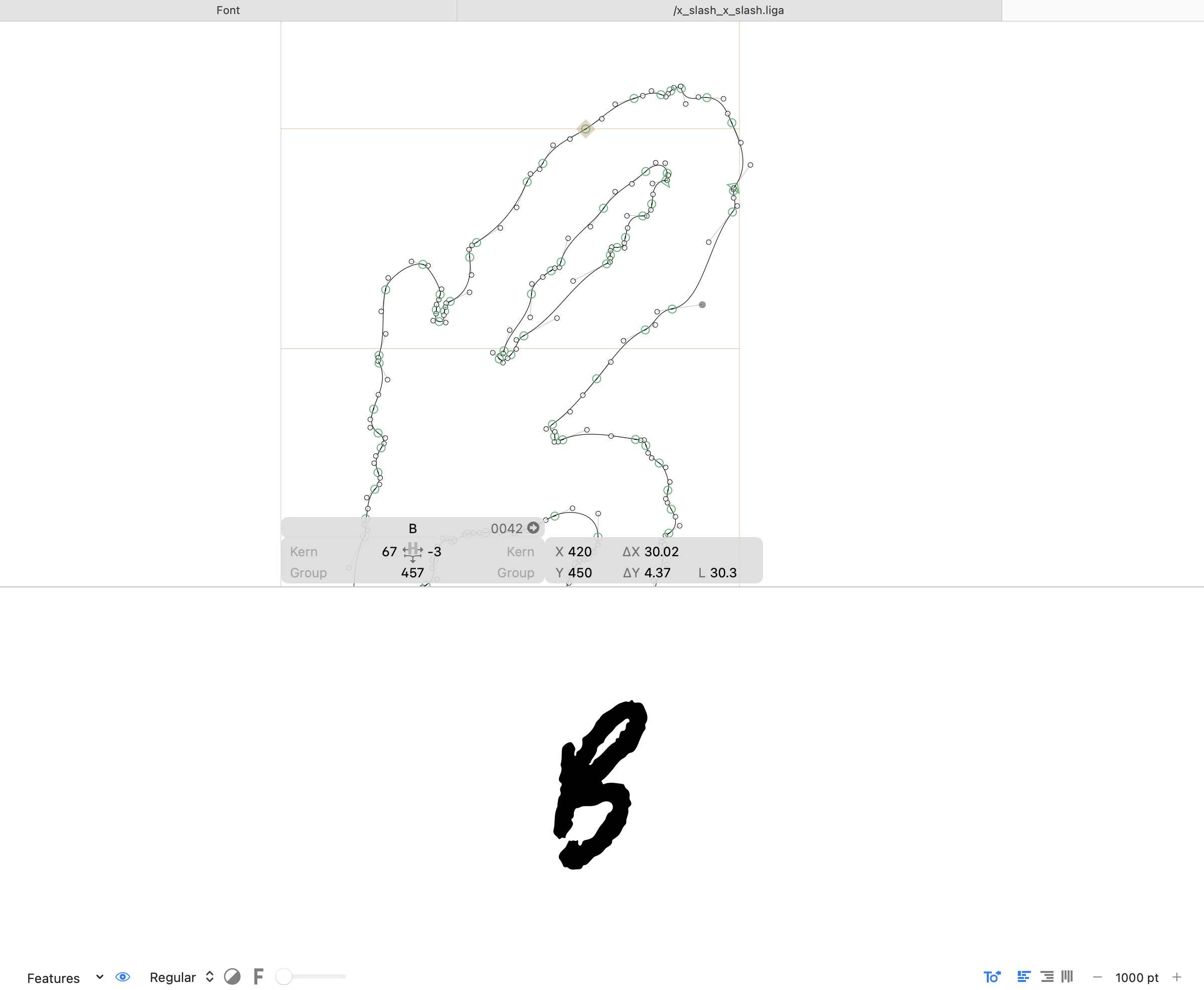
As each letter is imported into Glyphs App, it is refined. It's smoothed, roughened and adjusted. You can see this B is still very rough and textured, which was the original goal 😎
Making it work when it all comes together
After the timely creation of the 377 glyphs that Infamous is comprised of, it was time to zoom out and look at the typeface as a whole. Each glyph needs to play nicely with the glyph next to it. This includes its height, kerning, angle and ascender and descender positions.
I used my sample text and marked out all the areas that need work - either fixing characters, adjusting the kerning or creating new glyphs. You can see the culprits highlighted with green squares below. I type test the font in lowercase, uppercase and a combination of both to ensure the kerning is 👌🏼
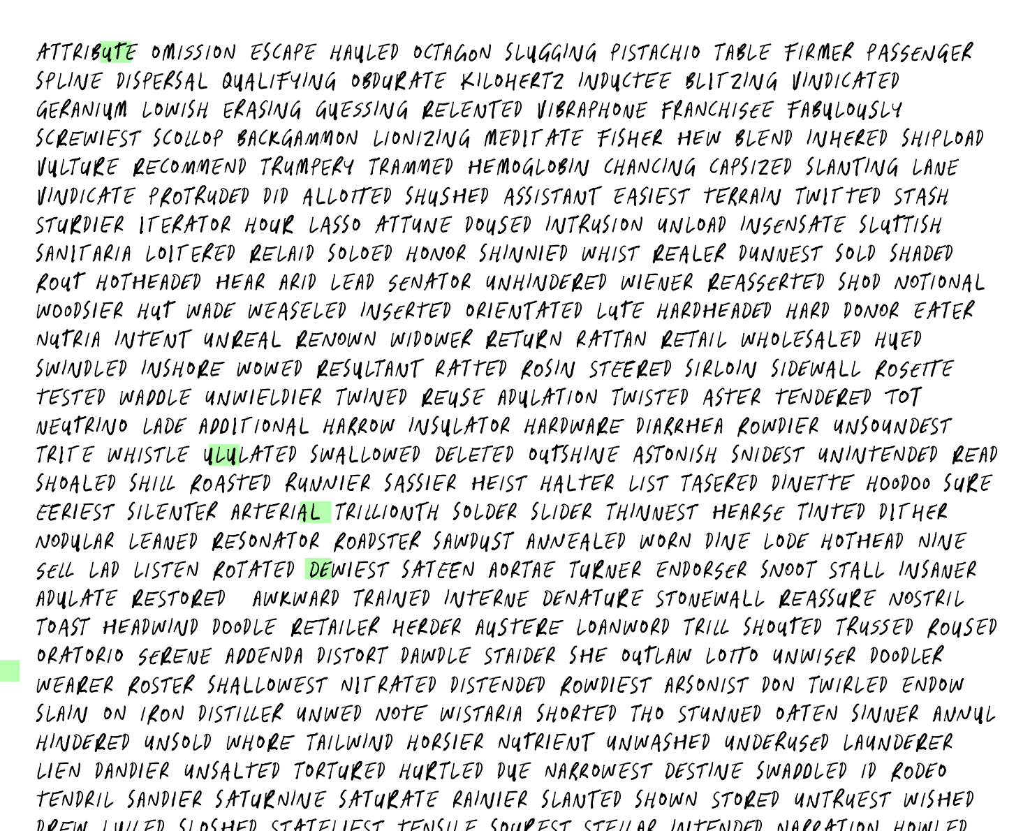
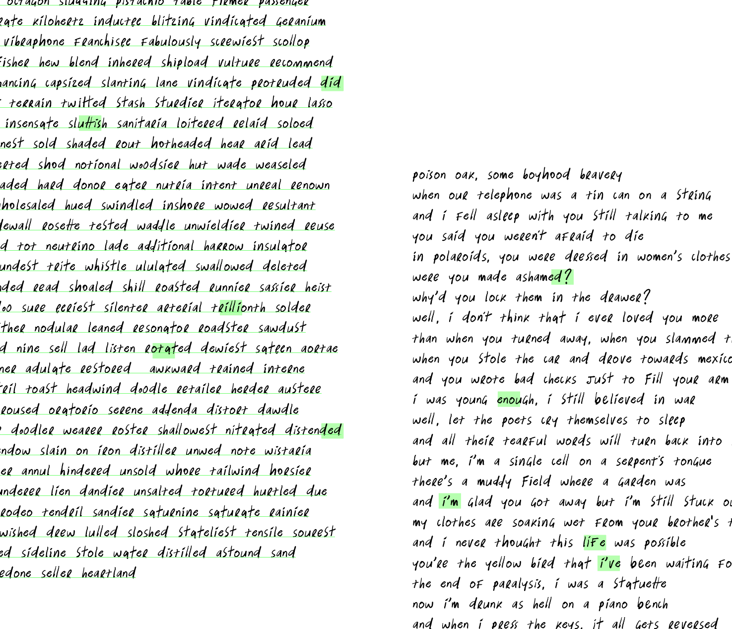
This part of the process goes on for as long as I let it, until I'm ready to let it be free in the wild.
I love where Infamous landed. It's got a great personality and I feel I achieved what I set out to achieve.
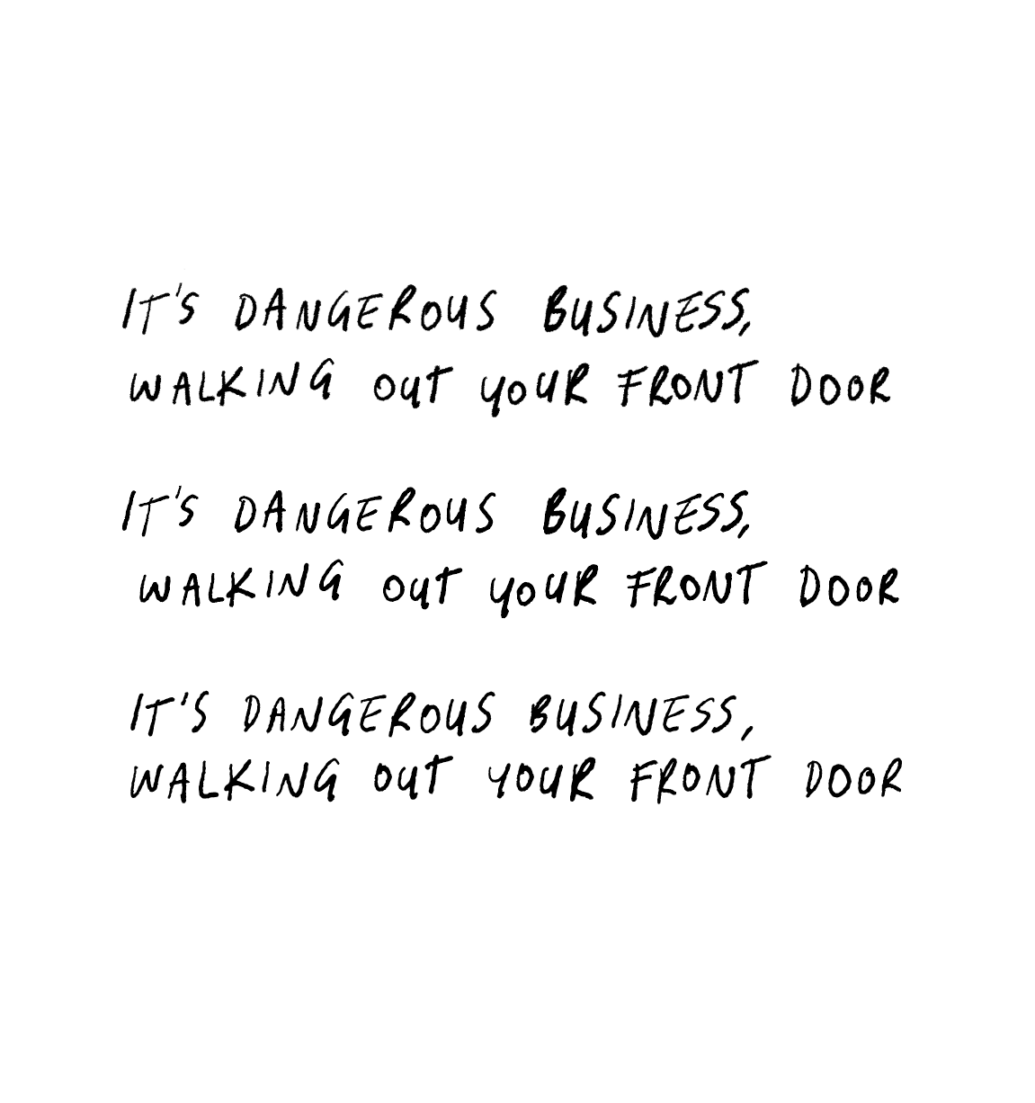
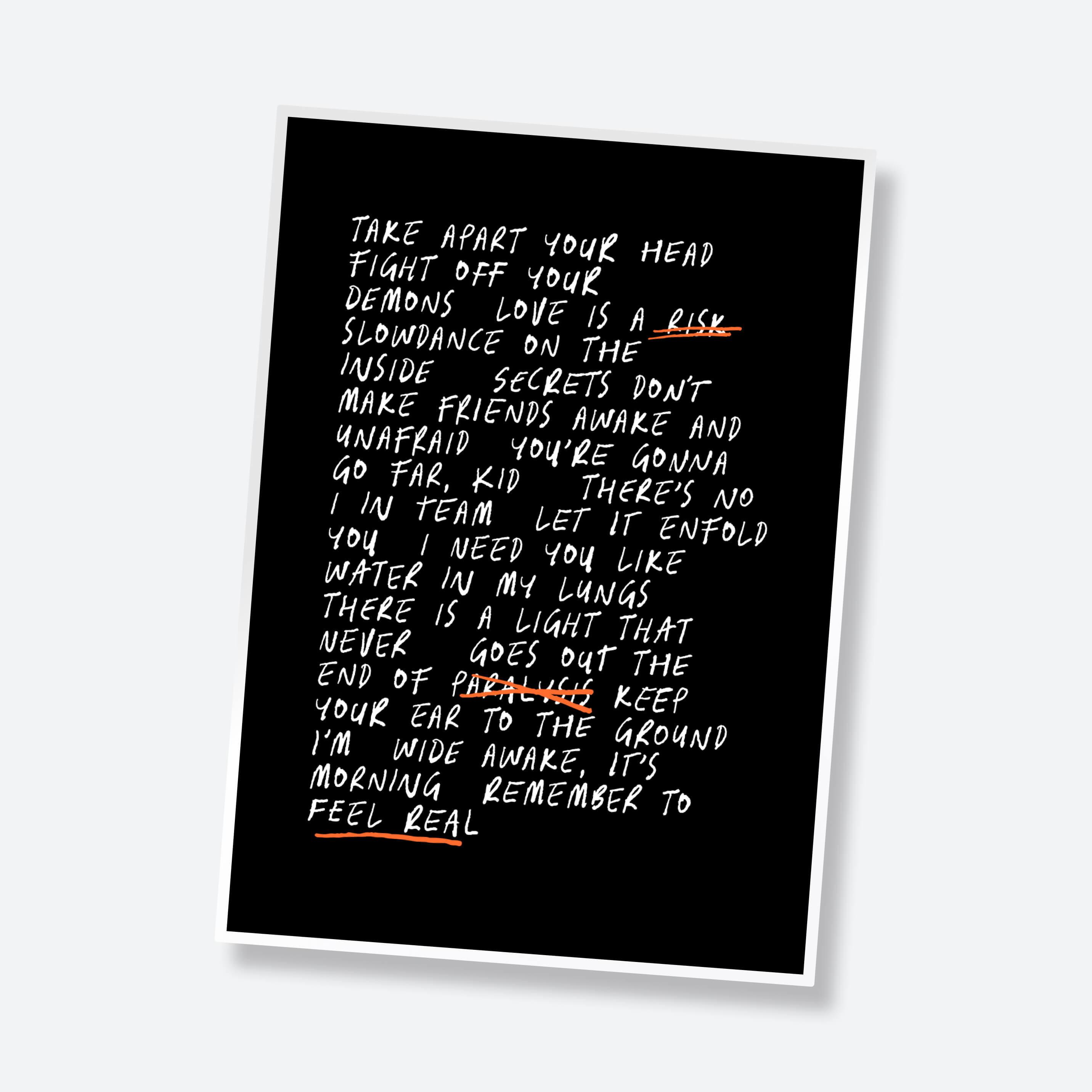
For reference, this is the 'poster with little to no treatment' that I wanted:
Let's not forget the 'promo stuff'
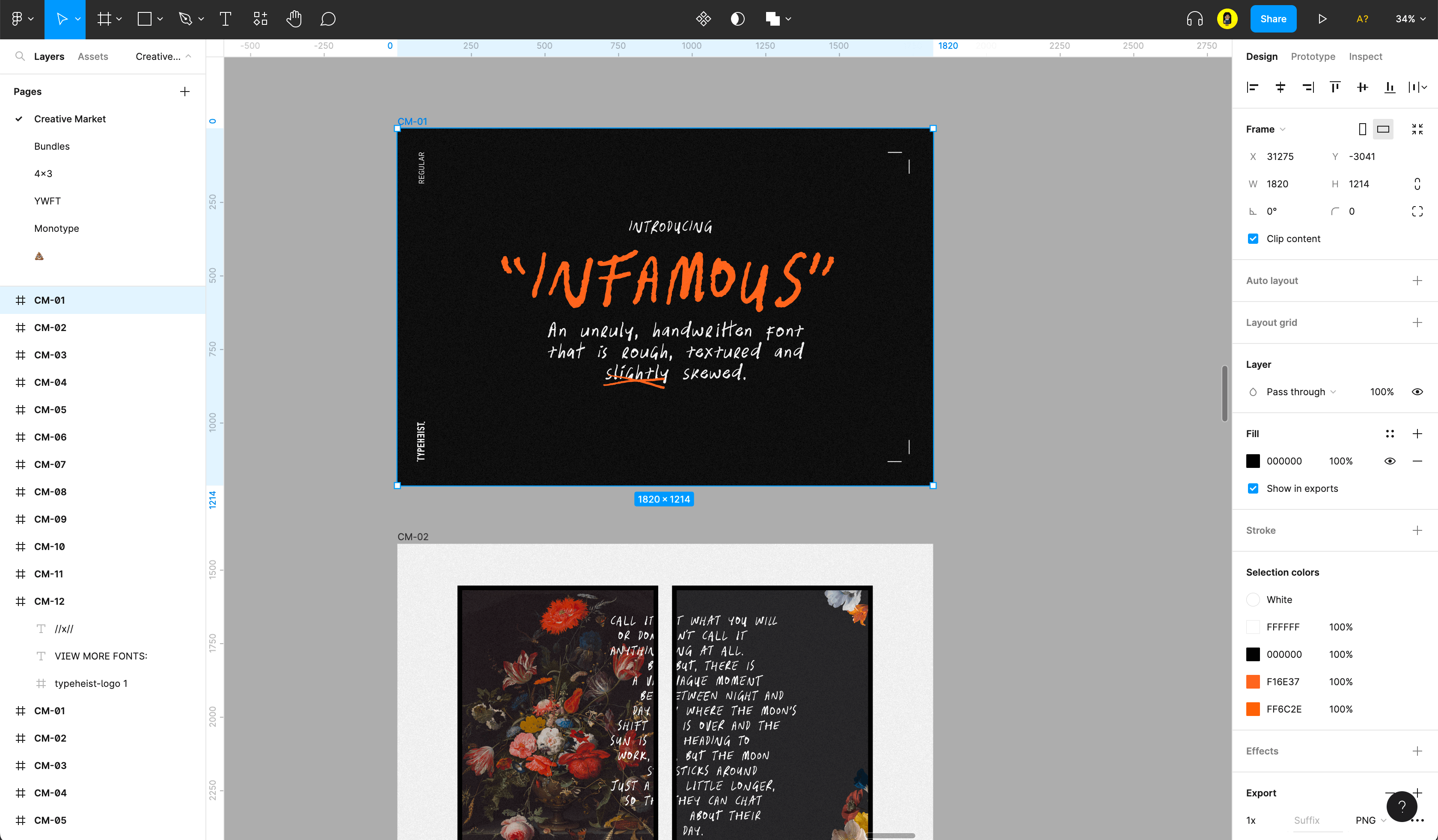
Throughout the whole process, I am generally creating the thumbnails in Figma as I go, whenever inspiration strikes ⚡️I usually find this part pretty fun, as it's another way I can be creative :)
And there you have it.
That's all for now :)
Laura
Infamous Font
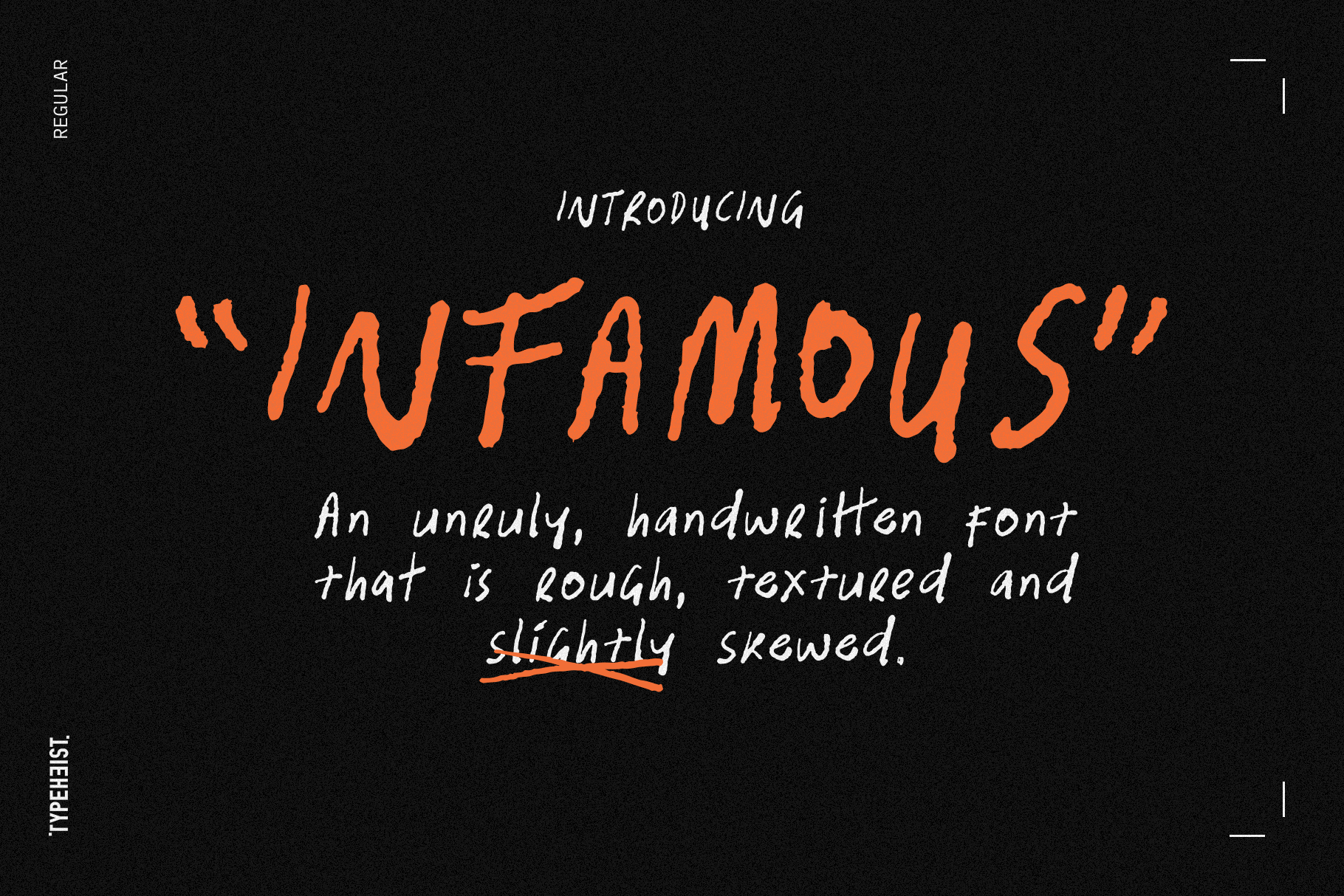
Infamous is a slightly italicised messy handwriting font. It's rough, scratchy and has a unique textured edge.
Keep reading
View all articles →12 Brands That Use Handwritten Type Beautifully
While many modern typefaces aim for precision and perfection, handwriting embraces small imperfections. Here are twelve brands that use handwritten fonts beautifully, and why their approach works.
Read on →Font Licensing for Video Games: What Developers Need to Know
Unsure which font license you need for a video game? Learn the difference between Desktop and App Licenses and how fonts can be used in games.
Read on →