Behind the Scenes: What goes into creating a messy handwriting font?
Handwriting fonts are a great way to add that personalised touch to a design or brand. There are thousands of unique fonts available, but what really goes into creating a messy handwriting font?
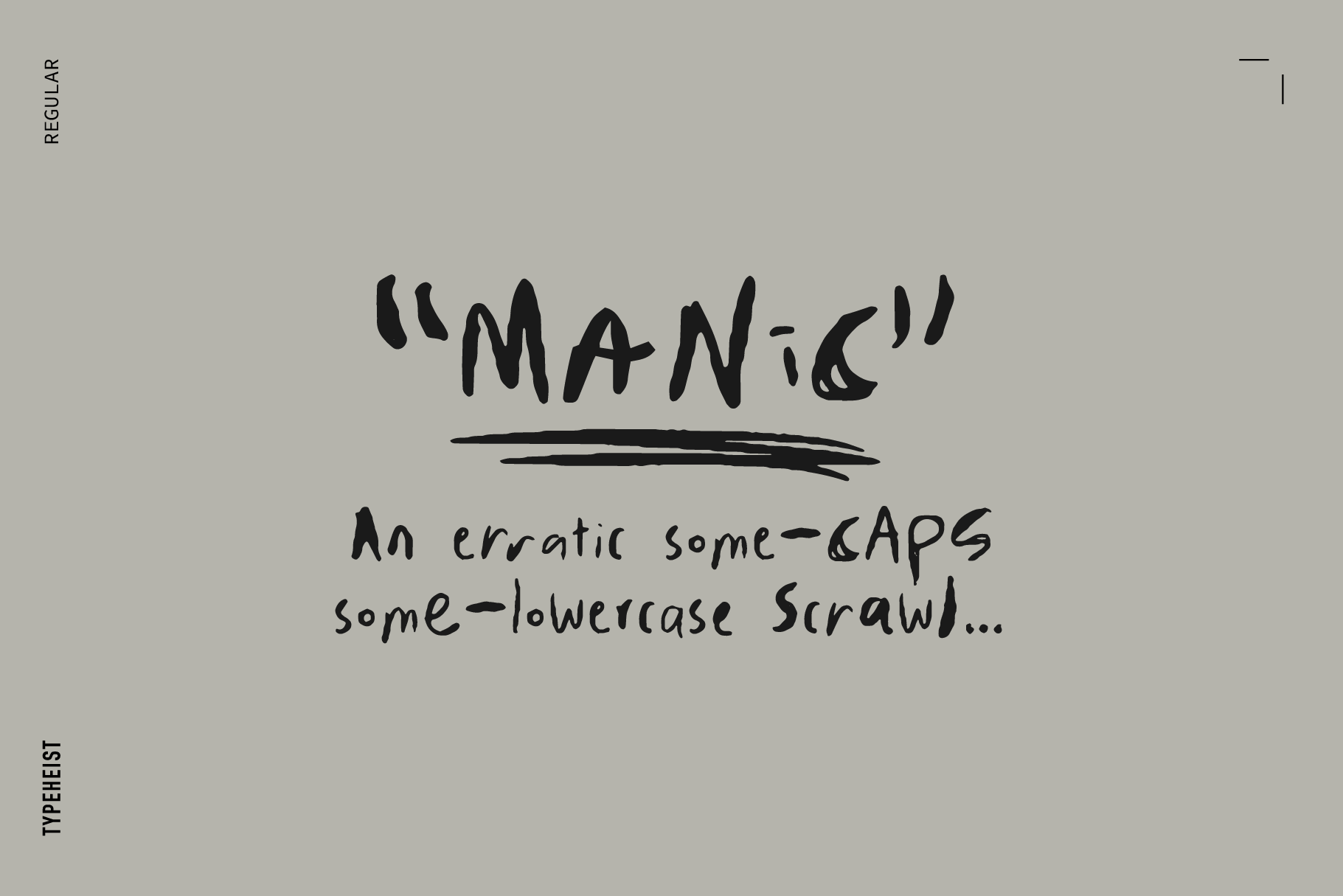
For me, the process of creating a handwritten font is a little more chaotic when compared to designing a serif or sans serif. There are fewer rules, and I find this means there is less focus on how each individual character looks, but how they all look and operate as a whole.
Here is my process when creating a messy handwriting font:
- Get inspired. At all points in time I have a notes document with various photos and screenshots I've collected along the way. They all give me inspiration for a new font in their own special way. It's a great starting point, especially if I'm feeling a little stuck.
- Start sketching.
I begin by sketching out sentences on either paper or iPad. I choose the medium depending on the font/look am creating. For a rougher font, I will use paper. If it needs to be more smooth or refined, I will use my iPad. So, what do I write? I tend to transcribe the lyrics to whatever song I am listening to (this generally happens to be some sort of early 2000s emo jam).
Once I have about a page of content, I also write out a couple of pangrams in uppercase and lowercase (if the font has both) to make sure I have the basic alphabet to work with. This loose method allows me to 'get into character' and get a feel for writing in a certain way. It’s also infinitely more natural than creating the characters individually. At this point I can also identify any recurring patterns or quirks in the handwriting that I can focus on. Here are some examples of these initial sketches: 
- d
Fonts in this article:
Keep reading
View all articles →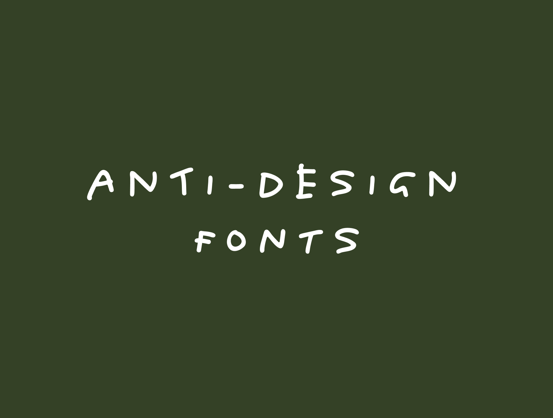
Anti-Design Fonts: Messy Handwriting Fonts That Feel Human
Messy handwriting, awkward layouts, scribbled notes and intentionally imperfect typography have become a core part of the anti-design movement. Rather than looking polished, these brands look human.
Read on →
12 Brands That Use Handwritten Type Beautifully
While many modern typefaces aim for precision and perfection, handwriting embraces small imperfections. Here are twelve brands that use handwritten fonts beautifully, and why their approach works.
Read on →


