Typeface classification: font styles explained
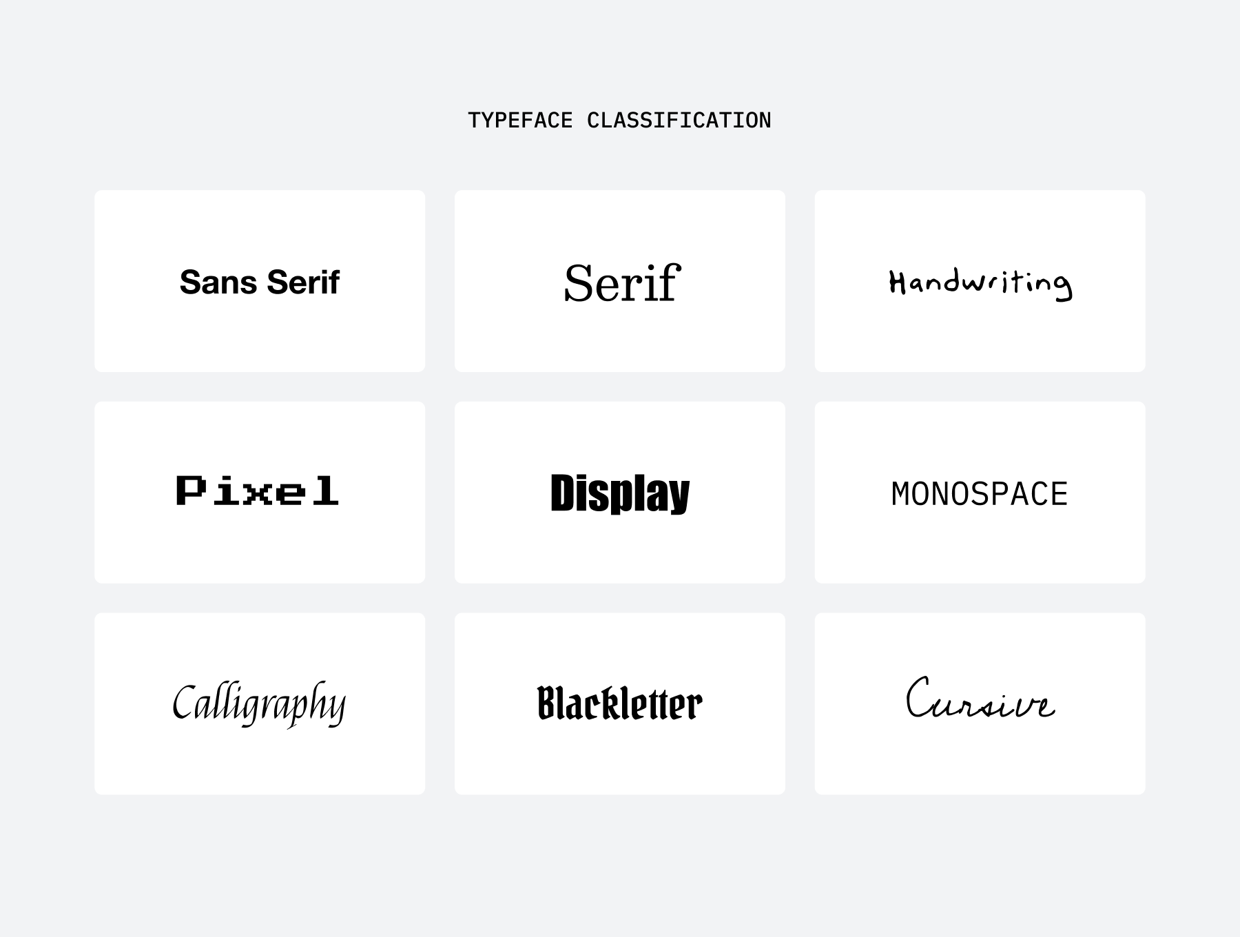
Script, cursive, handwriting, monospace? What's the difference between serif and sans serif? Heard these typography terms and now you've got more questions than answers? There are many different typeface classifications and sometimes multiple ways to refer to the same category. It can be a little confusing, so here is your quick guide to Typeface Classification.
Types of fonts
Typefaces are a great way to express and communicate your message effectively. Choosing the right style of typeface can impact the look and feel of a design (and even affect how your audience reacts to it). That's pretty powerful stuff 😎.
Let's have a look at the different font styles you have available to use.
Sans Serif fonts
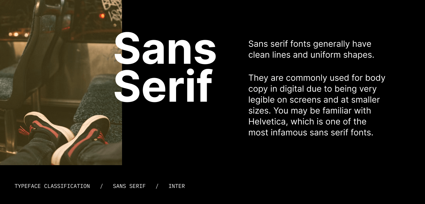
A modern and minimal style of type which, as the name suggests, has no serifs. Sans serif fonts generally have clean lines and uniform shapes. They are commonly used for body copy in digital due to being very legible on screens and at smaller sizes. You may be familiar with Helvetica, which is one of the most infamous sans serif fonts.
Sans serif fonts are also referred to as 'gothic' or 'grotesque'.
Serif fonts
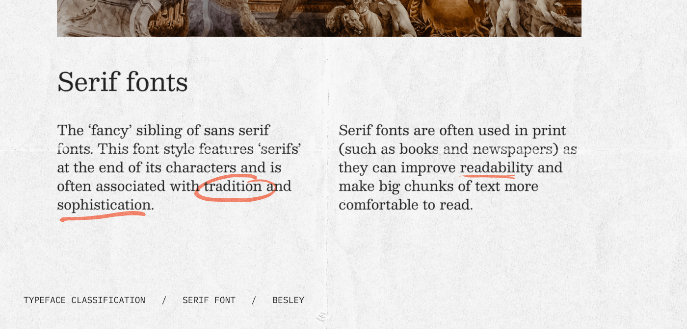
The ‘fancy’ sibling of sans serif fonts. This font style features ‘serifs’ at the end of its characters and is often associated with tradition and sophistication. Serif fonts are often used in print (such as books and newspapers) as they can improve readability and make big chunks of text more comfortable to read.
Popular serif fonts include Times New Roman, Georgia, and Baskerville.
Handwriting fonts
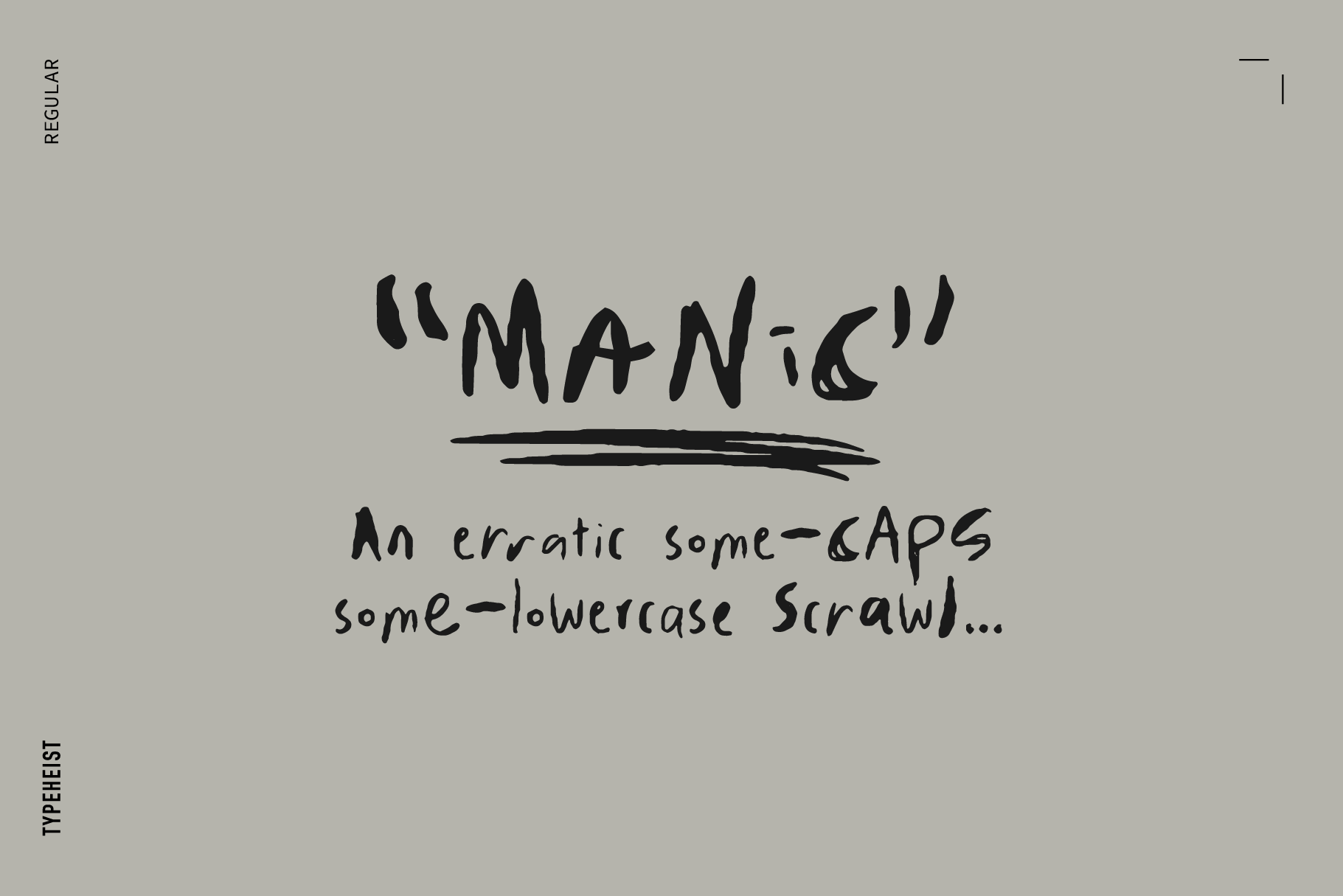
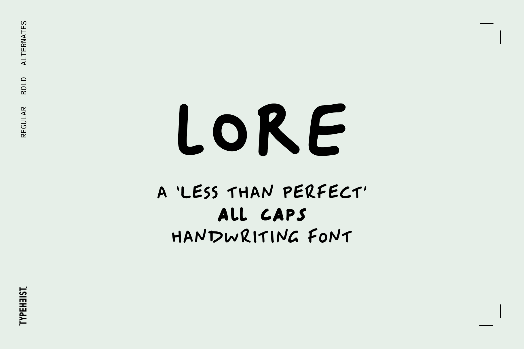
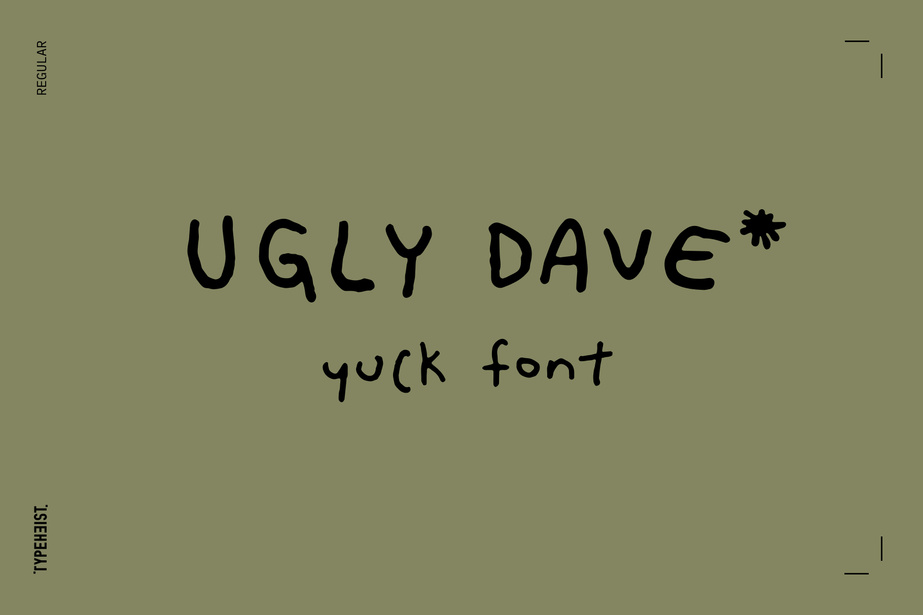
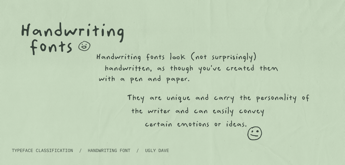
This is the bread and butter of Typeheist. Handwriting fonts look (not surprisingly) handwritten, as though you’ve created them with a pen and paper. They are unique and carry the personality of the writer and can easily convey certain emotions or ideas. You may encounter cute, classy or even messy handwriting styles.
Some examples of handwriting fonts are Manic, Ugly Dave or Lore.
Script or cursive fonts
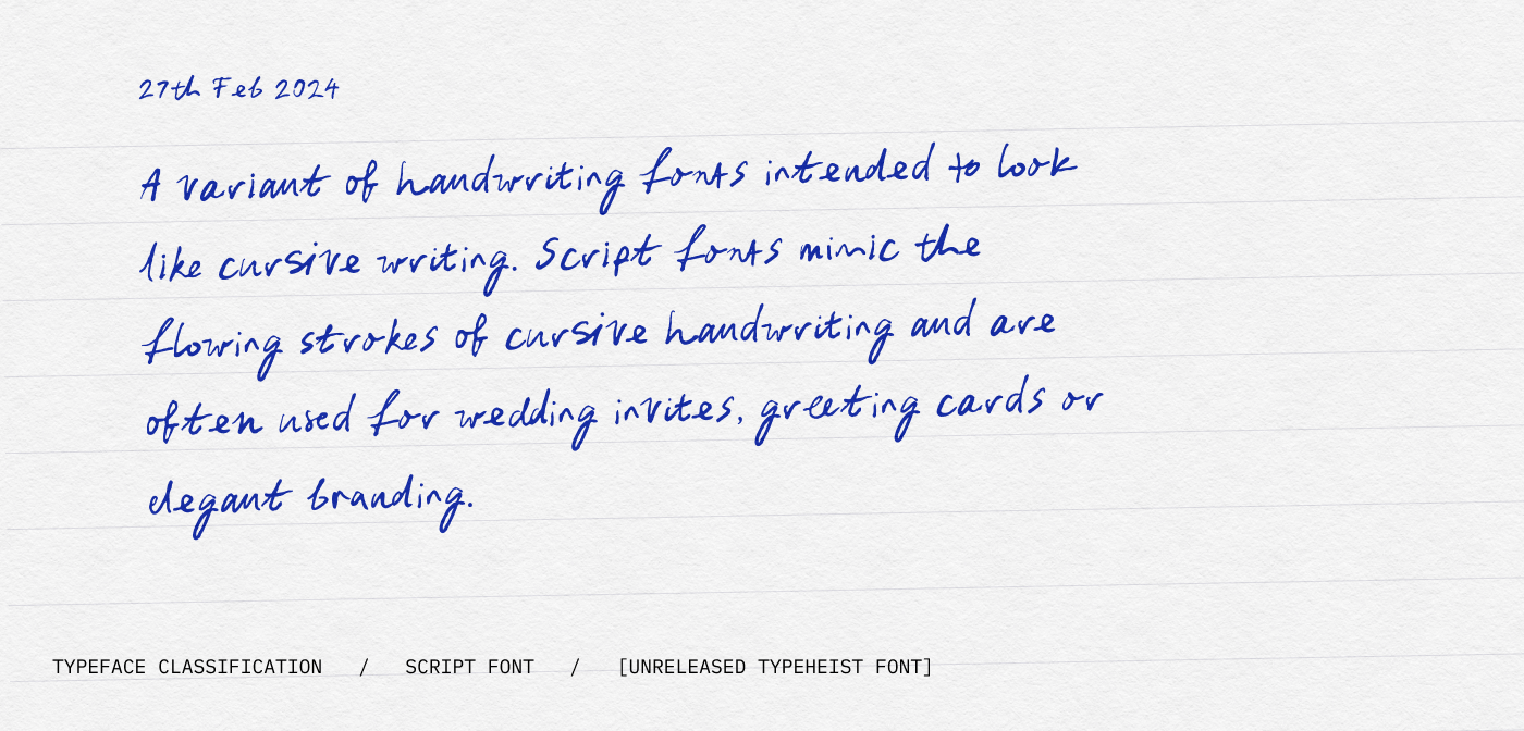
A variant of handwriting fonts intended to look like cursive writing. Script fonts mimic the flowing strokes of cursive handwriting and are often used for wedding invites, greeting cards or elegant branding. While they are eye-catching and stylish, they can be challenging to read in large blocks of text. Script fonts are typically used for titles, headlines or logos.
The font shown here is Belmonte Ballpoint in the cursive variant.
Display fonts
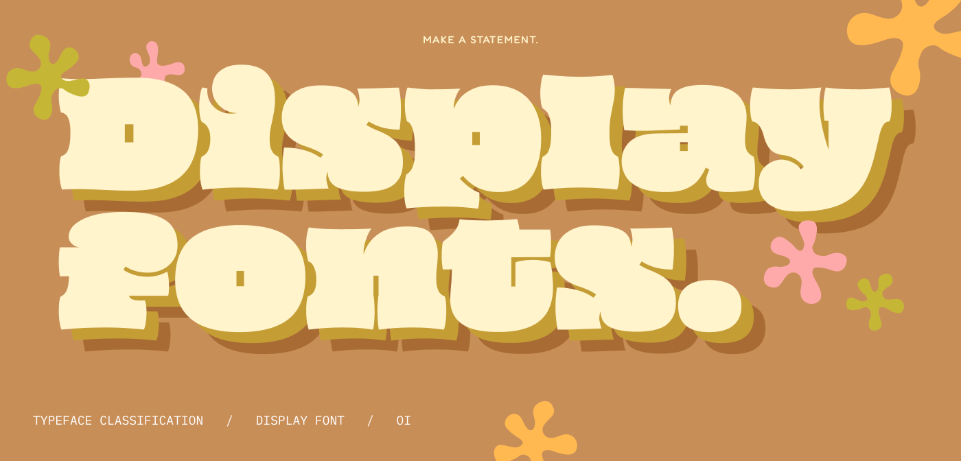
Need to make a statement? Display fonts are big and bold and look best at large sizes. While they don't conform to a specific style, they exude dominance and presence. This does mean they can be tricky to read at smaller sizes. Display fonts are commonly used for headings, posters, or other display purposes.
Calligraphy fonts
Typically created with a calligraphy pen, it’s much more ‘perfect’ than your standard handwriting fonts. The curves move in a pattern and mimic the fluid strokes of a calligrapher's pen.Calligraphy fonts come in various styles, from traditional to modern. They are often used in wedding invitations and certificates, where the design suggests sophistication or even royalty. Calligraphy fonts can be challenging to read in long passages, making them more suitable for titles, headings, and shorter texts.
Monospace fonts
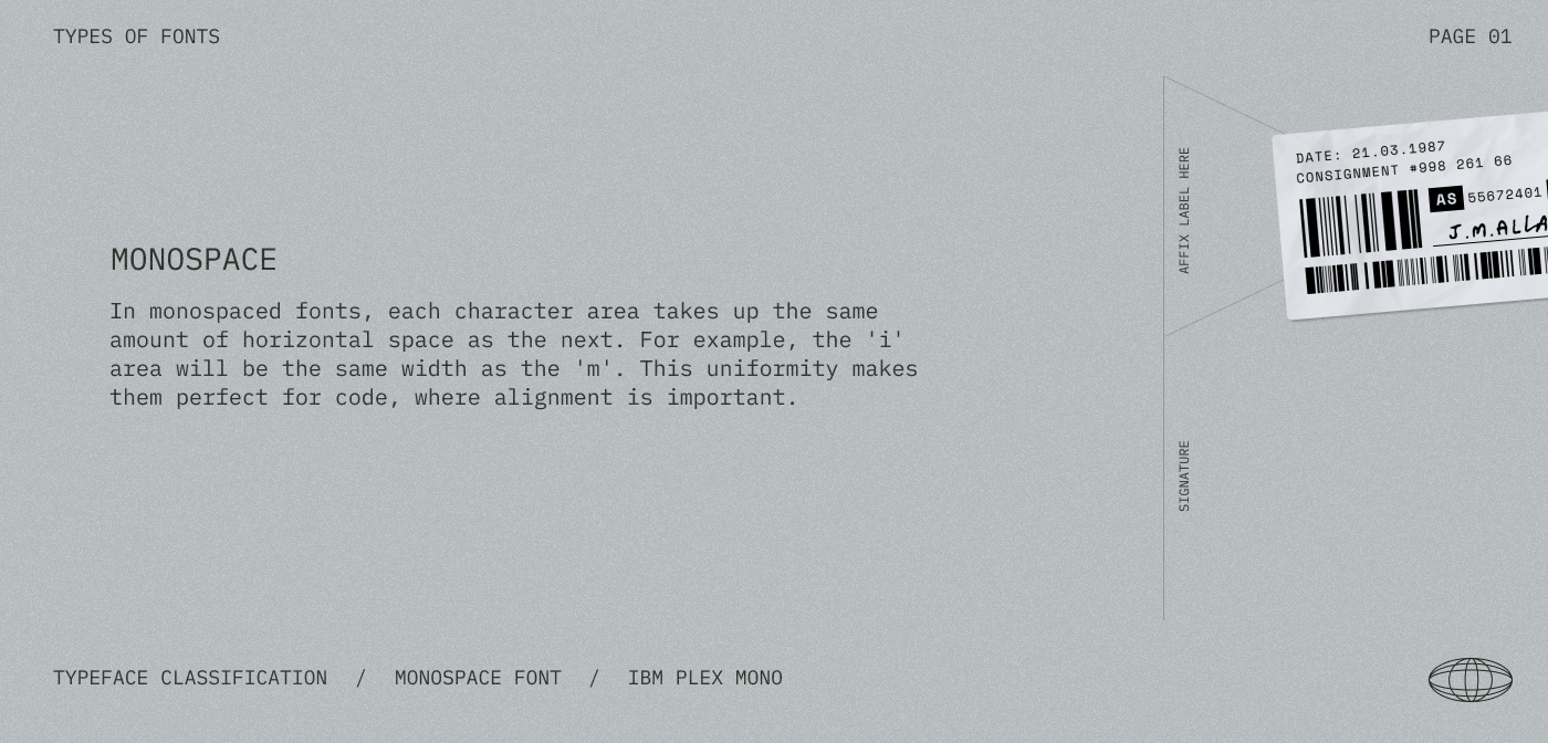
In monospaced fonts, each character area takes up the same amount of horizontal space as the next. For example, the 'i' area will be the same width as the 'm'. This uniformity makes them perfect for code, where alignment is important.
Blackletter fonts
Blackletter fonts, also known as Gothic or Old English fonts, have a distinct medieval charm. Characterised by elaborate and ornamental lettering, these typefaces are reminiscent of the Middle ages, where they were originally used in handwritten manuscripts.
While blackletter fonts are not great for body text, they can be effective for logos, titles or decorative elements.
![]()
Pixel fonts
Pixel fonts (or bitmap fonts) are created to look like typefaces from early computer interfaces or old-school video games. Tiny squares, or ‘pixels’, form each character within a grid; this forms the pixelated appearance.
The style of fonts you choose can make a huge difference to the look and feel of your design. Luckily for you, there is a wealth of classifications and styles for you to experiment with. You can even mix and match and pair with other font styles.
Happy classifying,
Laura
Keep reading
View all articles →Font Licensing for Video Games: What Developers Need to Know
Unsure which font license you need for a video game? Learn the difference between Desktop and App Licenses and how fonts can be used in games.
Read on →15 messy handwritten Halloween fonts
From jittery brush strokes to scratchy marker lines, we’ve curated 15 of our favourite spooky, messy and hand-crafted fonts to inspire your Halloween designs.
Read on →
