8 impactful font pairings for messy handwriting fonts
Let's take a joyride through eight bold font pairings that go together like peanut butter and jelly - they shouldn't work, but somehow they just do.
Side note: The ✨ New ✨ (free) Handwritten Font Pairing Guide is out now! It's 52 pages of tips, tricks and handwritten font pairing inspo.
Here are 8 designs featuring messy handwriting font pairings. And the best part? I've selected free fonts for all the non-handwriting pairings.

Sad Poem and Martel
Paired font style: Serif
Why it works: This unlikely duo combines the anxiousness of Sad Poem with the confidence and poise of Martel. Martel brings out the serif in Sad Poem, allowing them to work together nicely. The illustrations bring out the sketchiness in Sad Poem and add an unsettling little cherry on top.
Get these fonts: Sad Poem - $17 / Martel - Free

Wasted Year and Rubik
Paired font style: Display
Why it works: The extra thick boldness of Rubik Black contrasts against the thinner, more unreliable scratches of Wasted Year. By reducing the font size of Rubik and bumping up Wasted Year to the main feature, they don't complete for space. Instead, they complement each other and utilise the area well.
Get these fonts: Wasted Year - $17 / Rubik - Free

Lore and Catamaran
Paired font style: Sans Serif
Why it works: When I began pairing Catamaran (quite a quirky sans serif) with Lore Alternates, I felt like it shouldn't work. By muting the colour palette and relying on great photography, this duo came to life. In this website design, Lore feels playful without being overbearing as it is nicely balanced by the rest of the design.
Get these fonts: Lore Alternates - $18 / Catamaran - Free

Ugly Dave and Work Sans
Paired font style: Sans Serif
Why it works: The sans serif is a solid base for Ugly Dave and they harmonised quite well... so I wanted even more of a challenge. How could I make the very playful and causal font work for something as refined as a winery? The trick was to rely on a smaller font size with a bigger line height to give the air of sophistication, while allowing the handwriting font to breathe. The sketches add a bespoke, artisan feel.
Get these fonts: Ugly Dave - $17 / Work Sans - Free

Manic and IBM Plex Mono
Paired font style: Monospace
Why it works: This is definitely my favourite font pairing. Manic is so unruly, unstable and all 'round all over the place... which is perfectly complemented by the monospace font that is IBM Plex Mono. They just work so well together; I could make endless mockups with these two. You may also recognise IBM Plex Mono font from this website - I love it.
Get these fonts: Manic - $20 / IBM Plex Mono - Free

Prickly Pear and Tinos
Paired font style: Sans Serif Italic
Why it works: Combining chaos with italicised order. The concept behind this one was "could I create a design for a swanky museum by using a font that is as disorderly as Prickly Pear?". The italicised serif really tones down the rebelliousness and gives it an almost painted feel, and the fine lines and macro photography add an elegance to the design.
Get these fonts: Prickly Pear - $17 / Tinos - Free

Juniper Bay and Inter
Paired font style: Sans Serif Display
Why it works: Juniper Bay just looks so good in 'note' format. Inter is one of my favourite gothic fonts, and planting it big, bold and in your face gives this duo a good sense of balance. The weight contrast between the fonts feels good, especially for anything fashion or design related.
Get these fonts: Juniper Bay - $19 / Inter - Free

Infamous and Fjalla One
Paired font style: Condensed Display
Why it works: The harmonising use of uppercase is contrasted by the very different font styles. Infamous is a thin and wayward font that looks like it's been scratched into the paper. Fjalla One is a dominant font and one that was carefully balanced to avoid overshadowing its partner. Utilising bold colours and the Infamous's built-in scribble shortcuts to merge the two worlds, these fonts create quite a dynamic duo.
Get these fonts: Infamous - $17 / Fjalla One - Free
What's your favourite pairing? I quite enjoyed creating these and if you've got one to show me using a Typeheist font, I'd love to see it. You can submit your designs to the showcase (and you'll also get 20% off your next purchase 😎).
Happy fonting,
Laura
Keep reading
View all articles →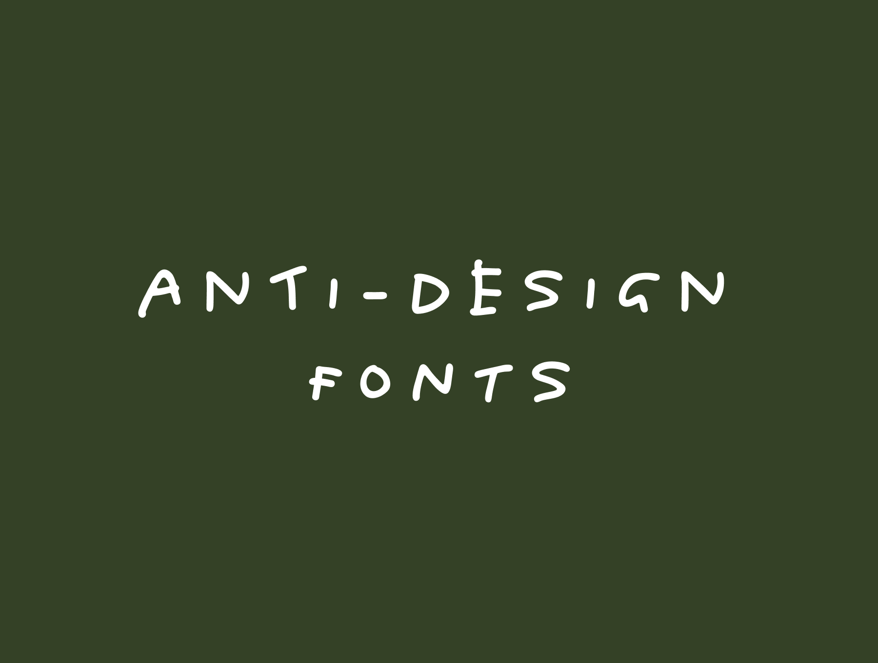
Anti-Design Fonts: Messy Handwriting Fonts That Feel Human
Messy handwriting, awkward layouts, scribbled notes and intentionally imperfect typography have become a core part of the anti-design movement. Rather than looking polished, these brands look human.
Read on →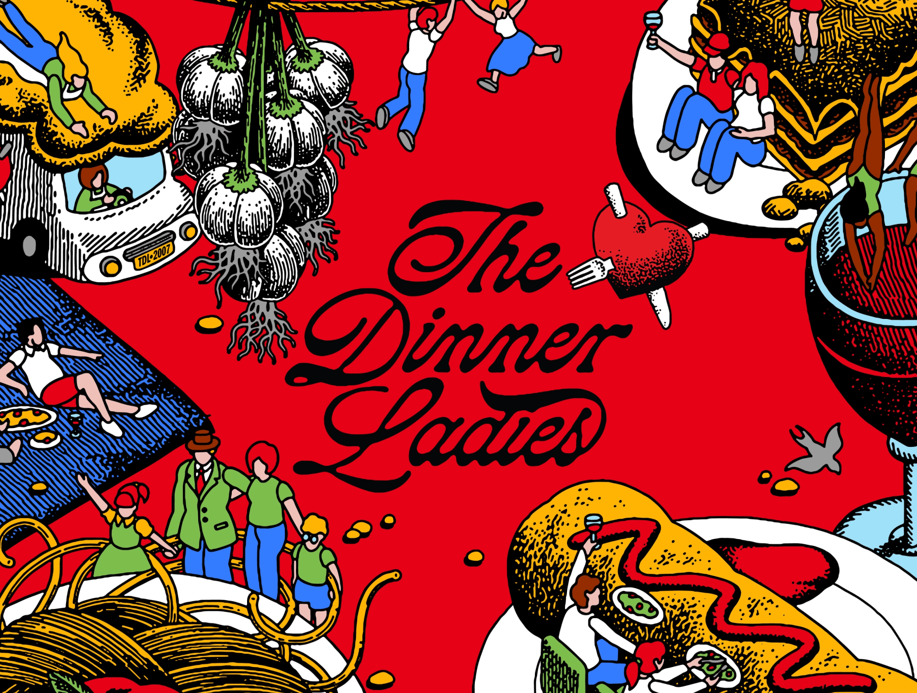
12 Brands That Use Handwritten Type Beautifully
While many modern typefaces aim for precision and perfection, handwriting embraces small imperfections. Here are twelve brands that use handwritten fonts beautifully, and why their approach works.
Read on →


